psydk.org
2018-09-16
PngOptimizer GUI redesign for GNOME
Last year I created a new git branch in order to redesign PngOptimizer GUI to match GNOME guidelines, after Ubuntu decided to use that desktop manager instead of their own one (Unity).
But at one moment, I lost my motivation because of one specific feature I could not convince myself that it would give a benefit for the user: the application menu.
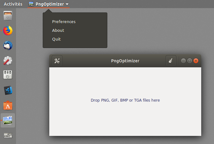
Here is a screenshot of the current state of the branch. The application menu is on the top left:

There are several things I do not like about the application menu as it is, for example:
- it is not obvious that additional items will be located there, like the Preferences or the About window;
- there is a large distance between the application window and the menu;
- it is not clear what strategy should be adopted when there are several application windows opened and a modal window, like the About window, opens.
So I let the branch rot for a while, though most of the work was done.
Then lately, GNOME 3.30 was released, with a very interesting changelog line:
application developers are recommended to remove their application menus in time for GNOME 3.32
So it seems I was not the only one having doubts about the usability of that application menu. This is good news, and it gives me the motivation to resume PngOptimizer adaptation for GNOME.

So now the next step will be to move the application menu content to a new menu called the "hamburger menu" which seems quite popular now. In GNOME, it is called the "primary menu".