psydk.org
2017-10-21
GNOME
Ubuntu 17.10 was just released and the desktop environment now uses a slightly modified version of GNOME.
One style change in the user interface I observed previously is now very present in many applications, mostly applications that ship with GNOME: they now have a tall title bar with buttons. That user interface element is called the "header bar".
For common dialog boxes, the changes are automatic. Here is for example the color picker dialog used in PngOptimizer. On the left, it's on Ubuntu 17.04, and on the right, on Ubuntu 17.10.
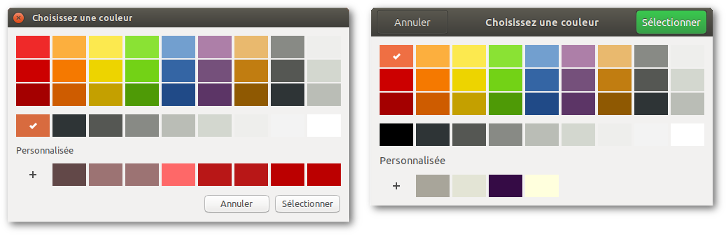
I still wonder if this is a progress from a user experience point of view. As I see it, a dialog box offers interaction elements that are browsed from top to bottom. At the bottom, my sight, thread of thought and also my mouse cursor, pause a bit to let me decide if I should validate or cancel my choices. That is a smooth process when decision buttons are also at the bottom. Now, you need to go back to the top to validate/cancel your choices.
However, that kind of user interface is common on smartphones, so for a lot of people their brains are trained to find the validation button at the top. I also think the header bar looks nice and as I want to be a good desktop environment citizen, I decided to upgrade PngOptimizer to use these header bars. It would be hard to port a heavy menu-based user interface like Gimp to a header bar interface, but for PngOptimizer where I just have three menu items in a context menu, I think it is a good fit.
Here are the steps I see:
- Update the Options dialog box. It is built from an XML file so I will do the change by editing it.
- Update the main window with a "Clear" and "Options" button.
- Move the "About" menu item to a new location proposed by GNOME: in the application menu located at the top of the screen.
- Remove completely the context menu.
- Update the About dialog. This one was not automatically changed like the color picker dialog, I don't know why.